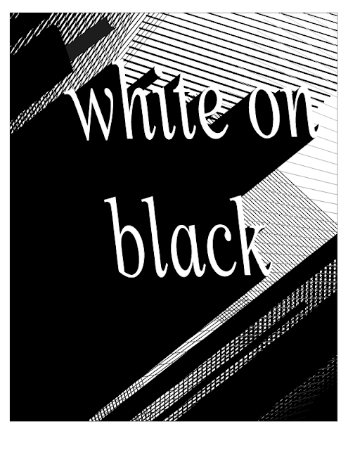
Typography - "White on Black"
Techniques
- Size - White on Black isn't a word, it's a description. However, it still evokes abstract feeling and concepts. When I think white on black, I think of something high-contrast and eye-catching, but also professional and mature. Therefore, I used large letters to catch the eye but kept the font lowercase.
- Shape - To continue the professional and mature look I chose "Times New Roman," a font that is gorgeous but often goes unnoticed. I kept the font completely sharp, straight and 100% legible and in-frame.
- Orientation - I have a problem and that is bad composition, but in this instance I couldn't think of any other way to orient this phrase. I was inspired by a poster for a Jazz festival, organized with the JA on the top line and the ZZ on the bottom with a large, jet-black shadow consuming the lower right-hand corner of the page, so thats what I did.
- Color - Black and White for white on black.
- Background - I really like lines. They are sleek, modern, minimalist, and professional. So, to break up the white space, I added a bunch of lines. Is it as clever or thoughtful as the previous images? No. Does it look really nice? I think so.


Comments
Post a Comment