Typography - "Implied"

Techniques
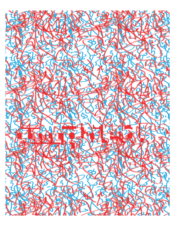
- Shape - I wanted to use a font that was distinct but not ostentatious. I think implied is kind of a mature word - kind of fancy - so I chose a serifed font. I kept it lower case to keep it inconspicuous. I also placed shapes around the text before deleting it as to imply the word being there.
- Texture - After I had achieved an implied shape, I still felt it was to distinct. I was struck with the idea to further obscure the word by emulating a pattern I had remembered from 3D books as a kid. Random shapes would be layered on top of each other in red and blue so when viewed with 3D glasses. the picture would visually pop off the page. The scribbles help to confuse the eye but the sharpness of the lines (hopefully) allow the word to remain visible.
- Color - As I wanted to emulate a classic 3D effect, I had to use the classic cyan and red colors. This simple 2 color scheme helps to further obscure the word, making it look suggested instead of overt.
- Size - The word is quite large on the page but remains well within the borders of the image. As I wanted to both hide and show the word, I made it large enough to detect without fully distracting from the pattern, like a reverse magic eye painting.
- Location on the Page - The word is somewhat central in the page because I wanted to strike a careful balance between visibility and obscurity. However, it is not smack-dab on the page because I wanted a little more subtlety in this image.

Comments
Post a Comment