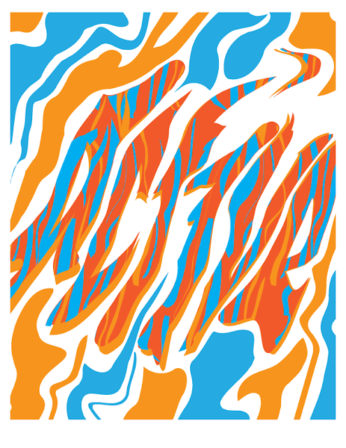
Typography - "Active"
*The definition isn't wholly accurate to the image
Techniques
- Shape - I wanted this word to look dynamic, so I used the warp tool to bend and kind of melt the word so it would have movement but maintain its basic shape. After learning from my "Implied" typography, I didn't completely squish the shape so it could retain some semblance of readability
- Color - I looked up images on Google to find what colors were most commonly associated with the word active. Of course, they were mostly brands and motivational quotes and what not, but I did notice that blue was a common color. Blue and orange have been used to make pretty things since the dawn of time, so I chose a light shade and a slightly darker, redder shade of orange for my other colors. I think these vibrant colors give an active vibe.
- Orientation - I wanted this word to feel like it was being kind of washed around, like something floating on top of water or cartoony flames. The words are skewed slightly diagonally to create this affect.
- Location on page - This word takes center stage, for emphasis. I saw no reason to hide this word around like I did in the "Implied" piece, so I kept it simple and centered, allowing the eye to movie across the page via the location on the page - as well as up and down by following the pattern and background.
- Texture - I don't know if this qualifies as texture per-se but I created the pattern to reinforce the movement of the word. Instead of using sharp, thin lines to make active seem fast I wanted to used slightly thicker, goopy lines to make it dynamic and flame-like.


Comments
Post a Comment